
Sector periodic table of returns
A sector quilt chart — the Callan-style periodic table (or asset allocation quilt) applied to the eleven GICS sectors. Each S&P 500 sector is a colored tile that climbs or sinks in the yearly ranking; best performers rank first. Built from SPDR Select Sector ETF total returns (dividends reinvested). Switch the trailing period to 3, 5, 10 or 15 years to rank by annualized returns and smooth out the year-to-year noise, or toggle the orientation if you prefer years across the top.
Methodology
Each sector is proxied by its SPDR Select Sector ETF (shown in the legend). Annual total return uses the ETF's split- and dividend-adjusted year-end close versus the prior year-end. The most recent column is year-to-date and still moving. The nine original sector funds launched in late 1998, so the table starts in 1999; Real Estate (XLRE) was carved out in 2015 and Communication Services (XLC) in 2018, so they show empty cells before they existed. The multi-year trailing views (3, 5, 10, 15) rank each sector by its annualized return (CAGR) over that window, derived from the endpoint adjusted closes — true compounded returns, never averaged annual figures; a sector appears only once its ETF has a full window of history. Past performance does not predict future returns; not investment advice.
FAQ
- What is a sector quilt chart?
- A sector quilt chart ranks the annual total return of each S&P 500 sector — technology, financials, energy, health care, utilities and the rest — for every year, stacking the best performer on top. It applies the asset allocation quilt (or Callan periodic table) format to the eleven GICS sectors.
- How is this different from the asset allocation quilt?
- An asset allocation quilt ranks broad asset classes (stocks vs. bonds vs. gold vs. international). This sector version drills into US equities and ranks the eleven GICS sectors against each other, so it shows sector rotation within the stock market rather than across asset classes.
- What does the sector quilt show?
- It shows sector rotation: the leading sector changes almost every year, so chasing last year’s best sector is rarely rewarded. The shuffling tiles make the case for diversifying across sectors rather than concentrating in the recent winner.
More visualizations
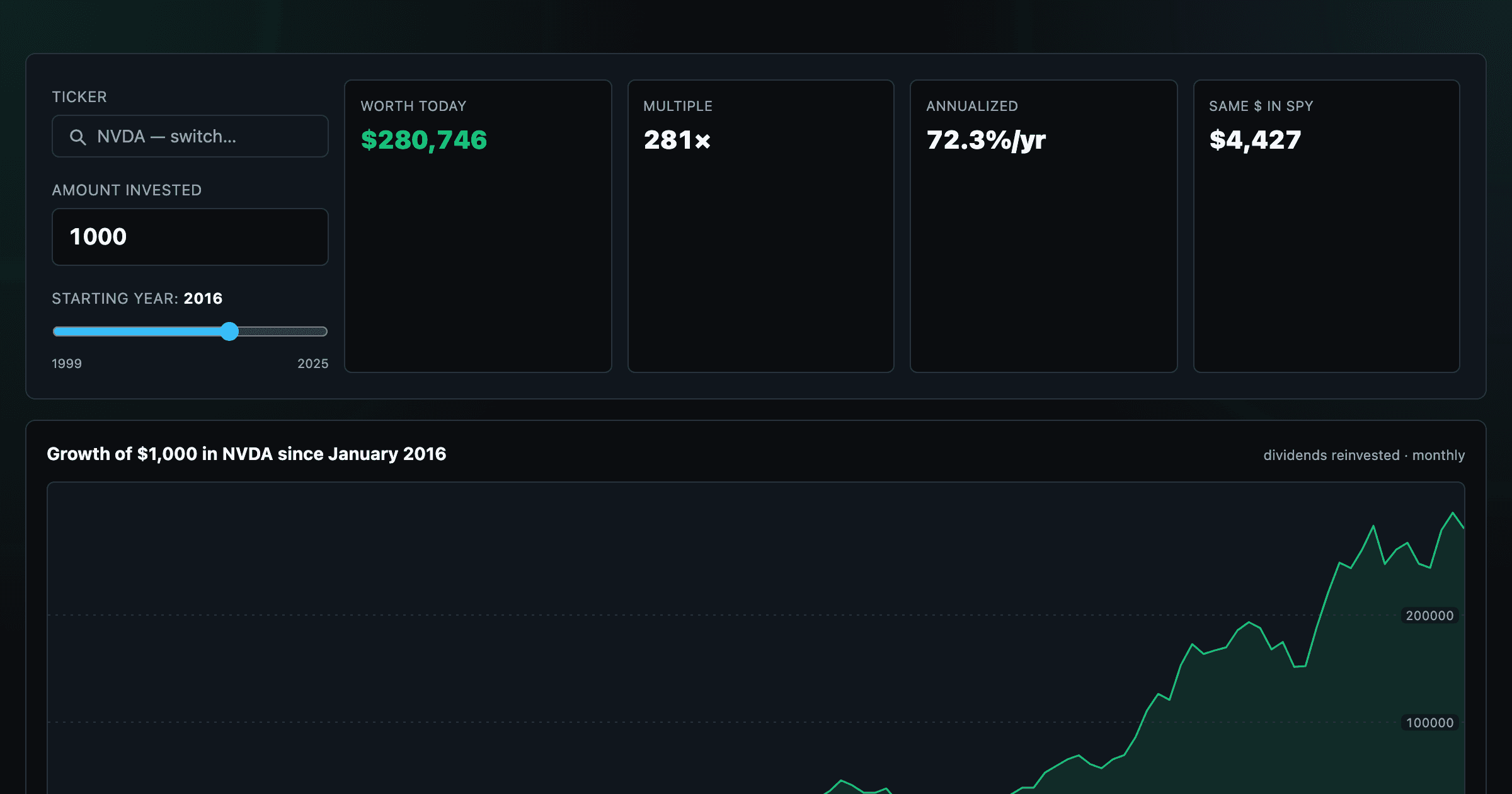
What $1,000 in any stock or ETF would be worth today.
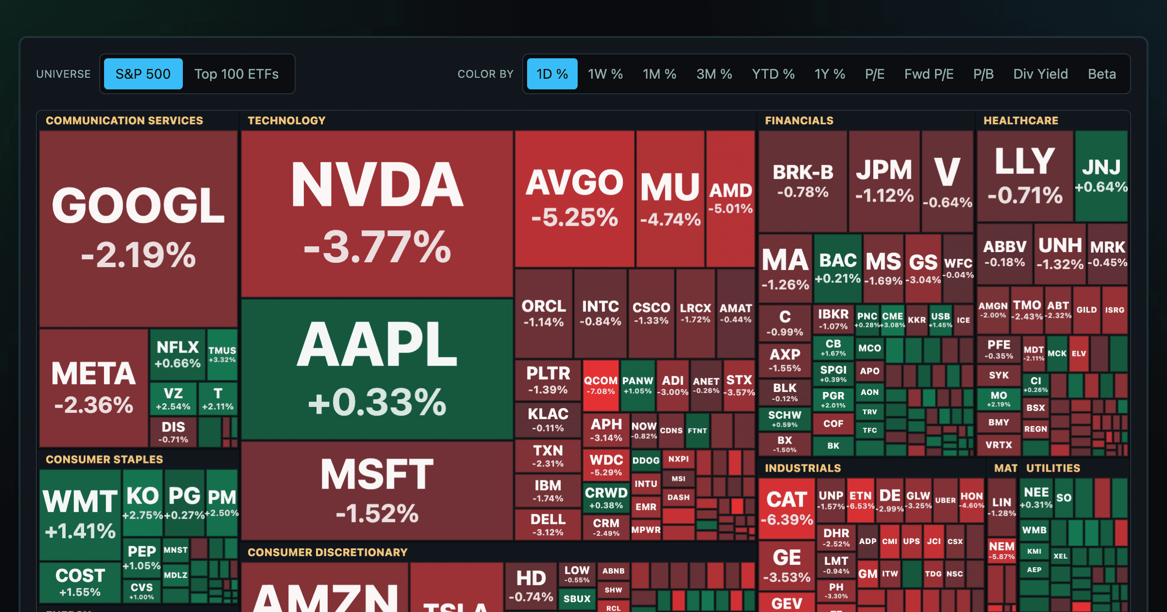
Every S&P 500 company sized by market cap — color by return or valuation.
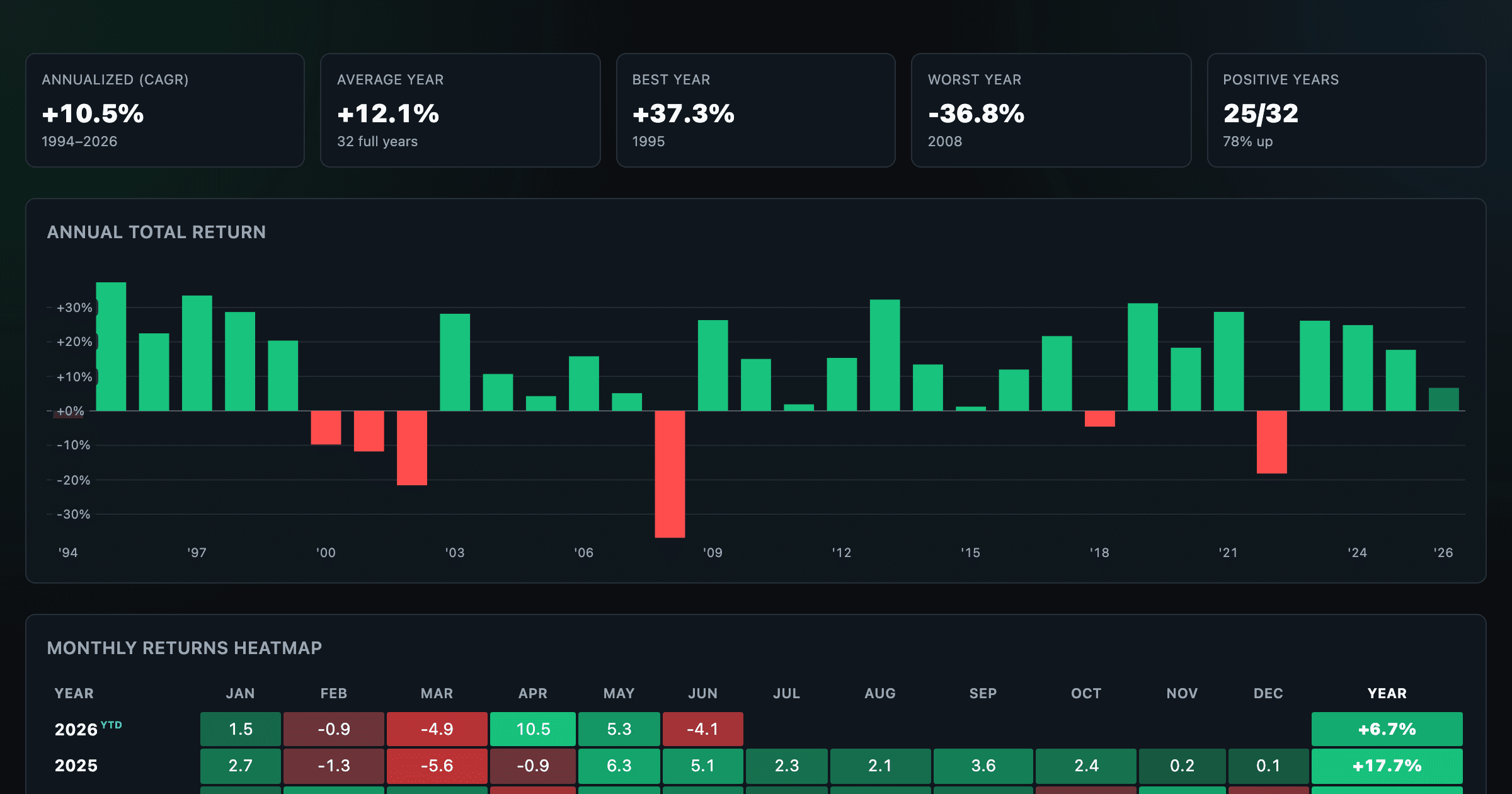
S&P 500 annual and monthly returns — every year, every month.
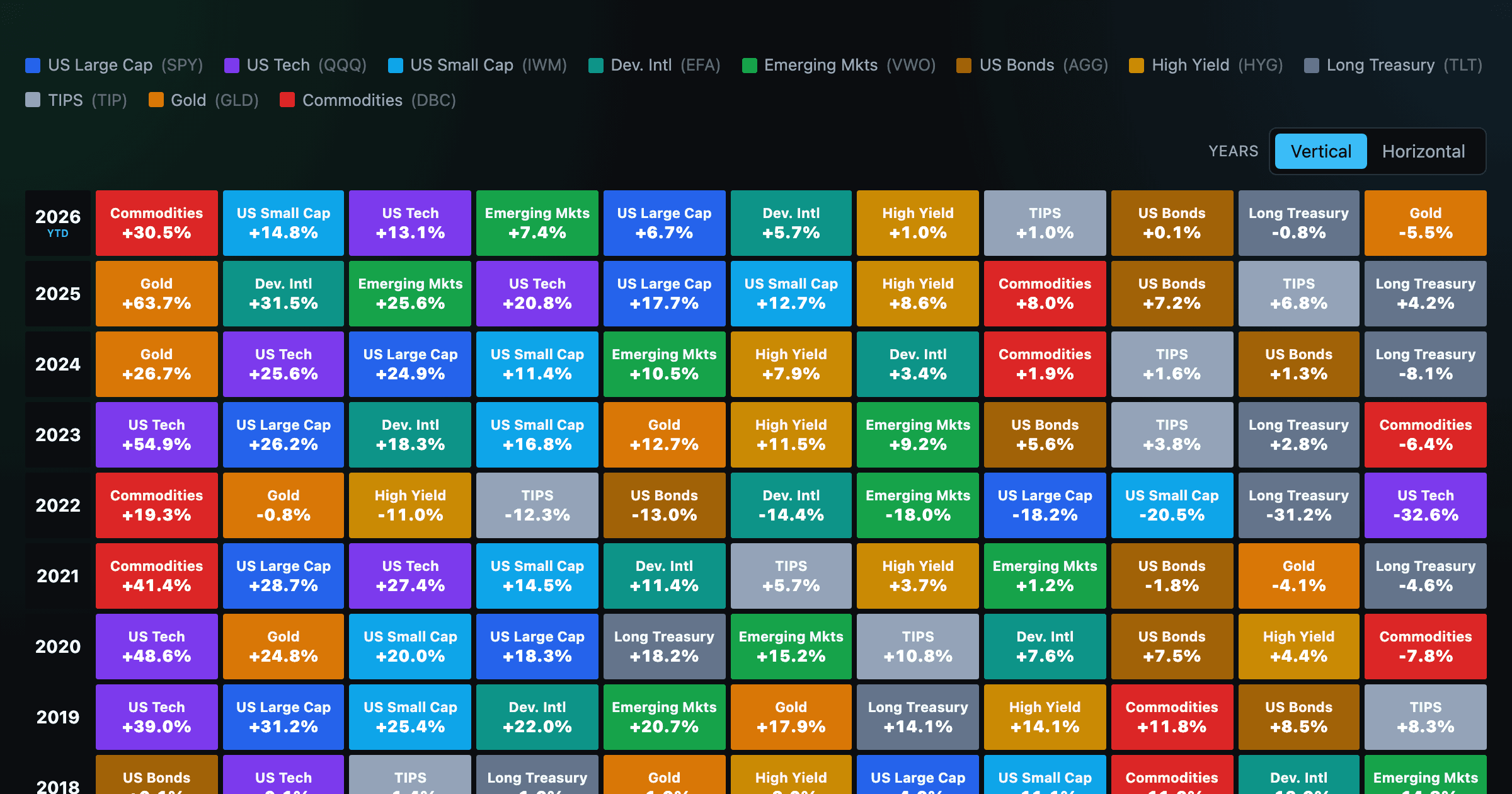
Asset-class returns ranked year by year — the Callan chart / asset allocation quilt.
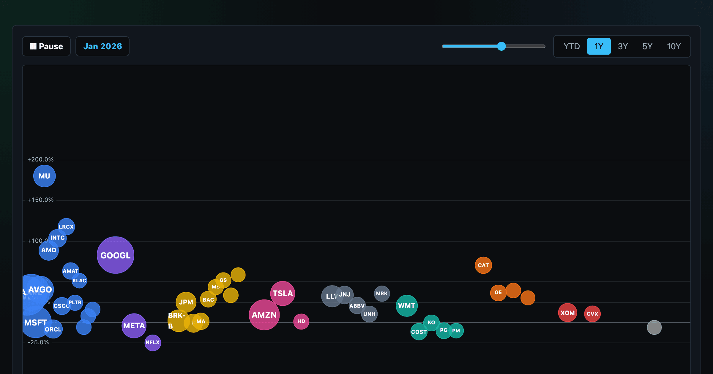
The biggest US companies as animated bubbles, rising and falling with their total return over time.

How recent stock-market debuts have performed since listing — annualized, vs the S&P 500, by IPO vs spin-off.
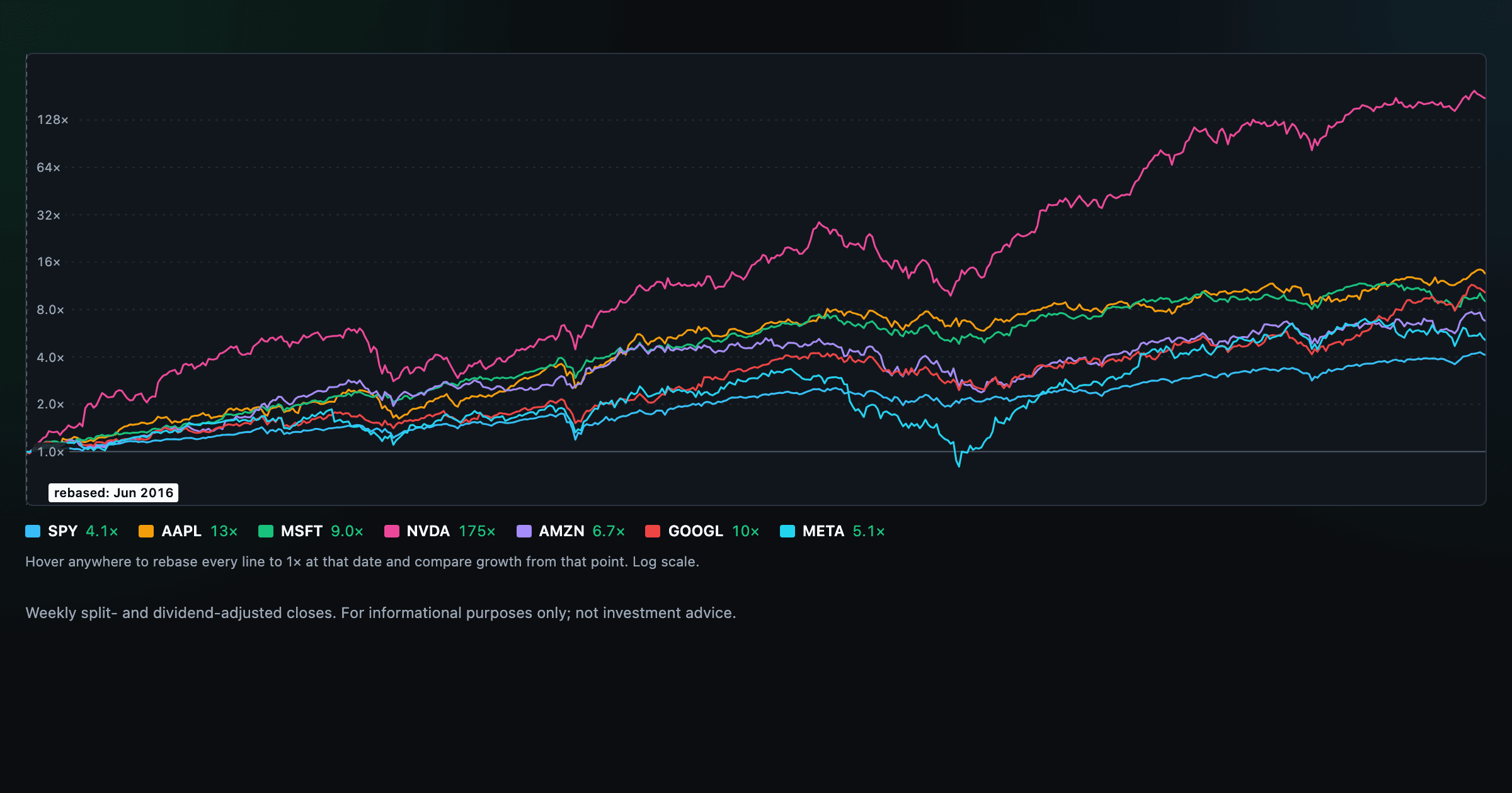
Compare megacaps vs the S&P 500, rebased to 1× at any date you hover.
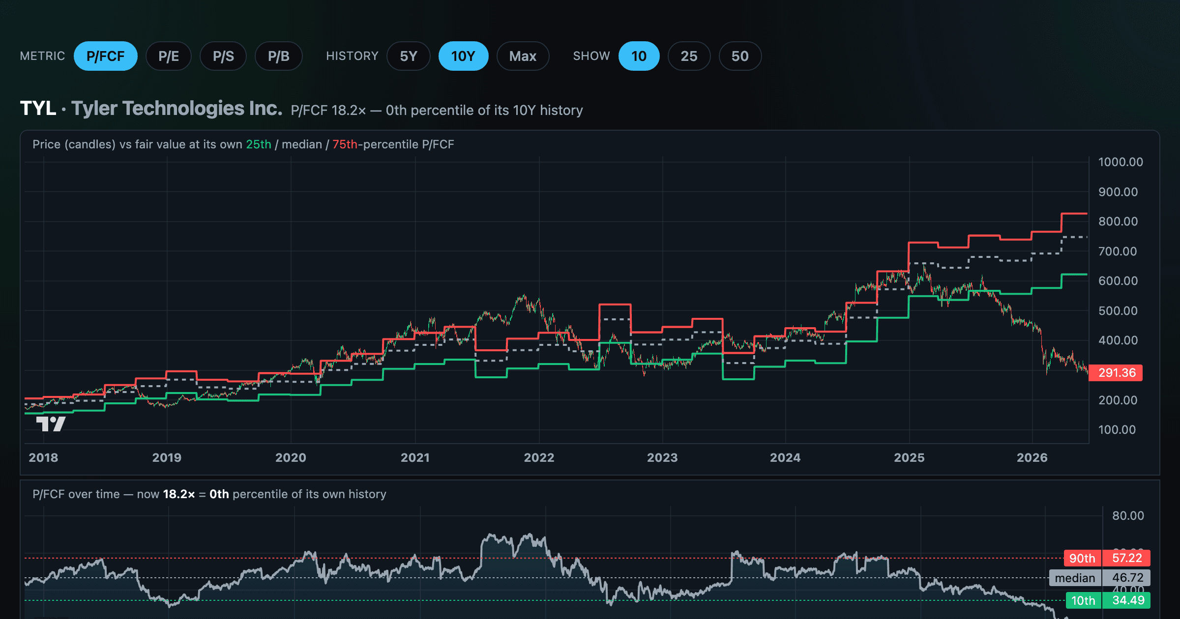
Stocks trading cheapest relative to their own P/E, P/FCF, P/S, or P/B history — with fair-value bands.
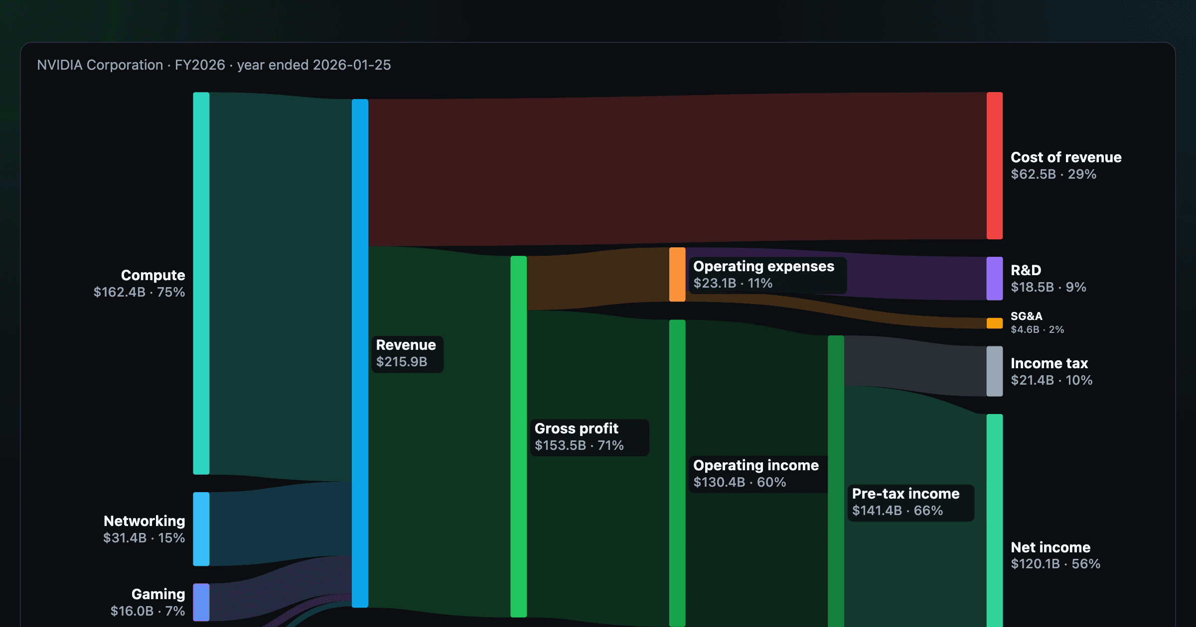
Follow a company's revenue through its income statement as a Sankey — costs, taxes, and profit.
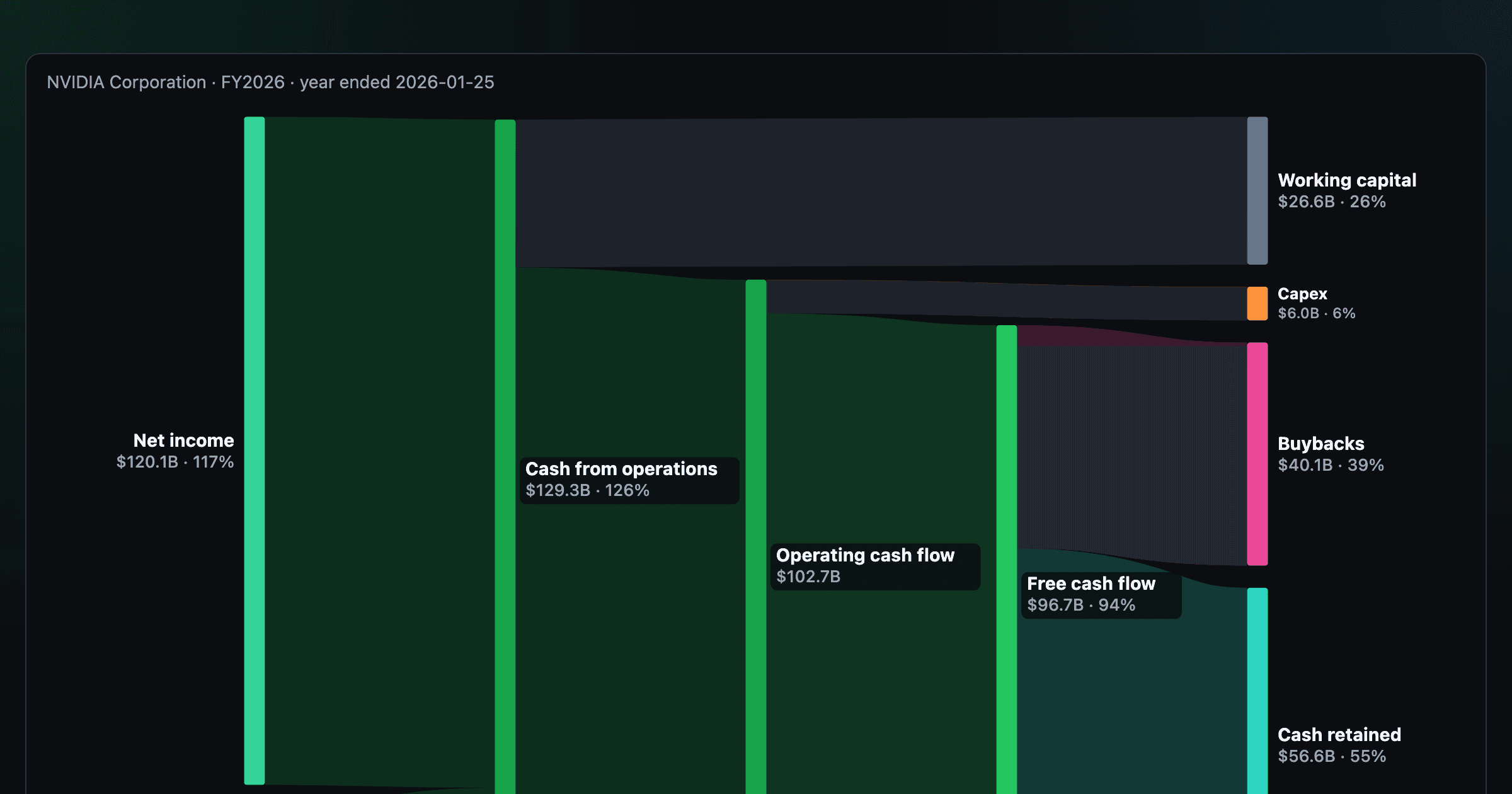
Follow a company's cash from net income through operating cash flow into capex, buybacks, and dividends.
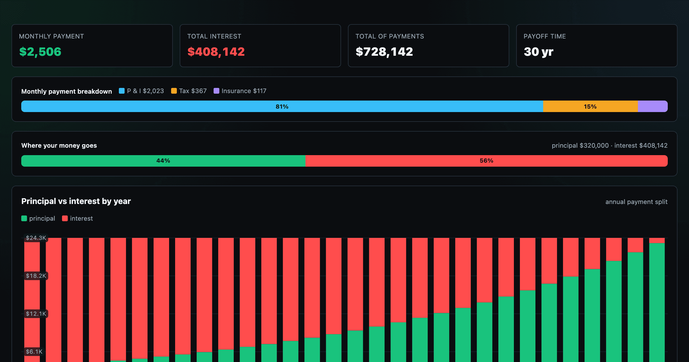
Monthly payment, principal vs interest by year, and the balance paydown — with extra-payment savings.
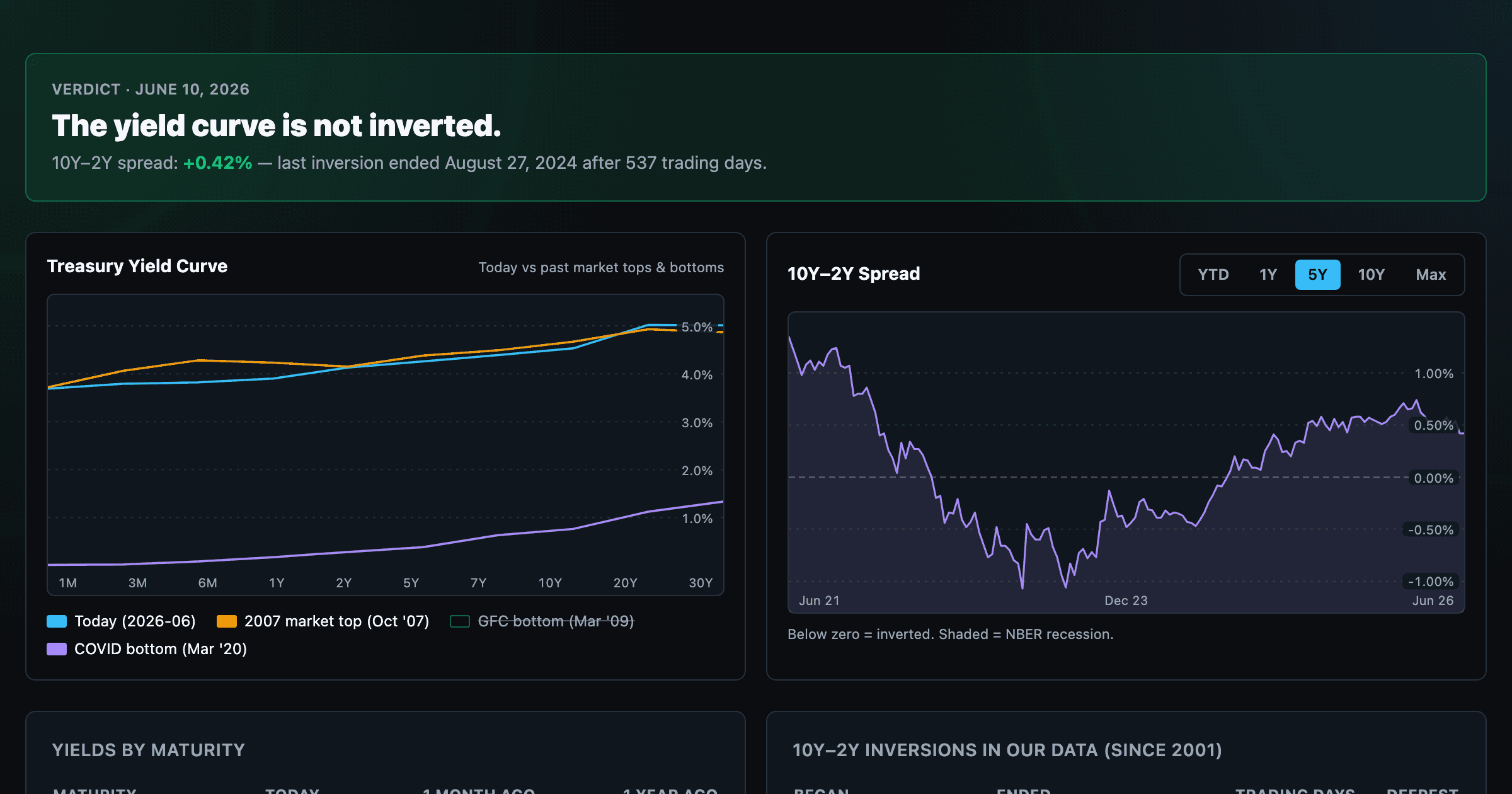
Live term structure, the 10Y–2Y spread, and every inversion episode.